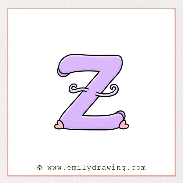
A fancy letter Z is a fun way to practice smooth curves and bold strokes.
This easy drawing tutorial uses simple shapes and a few decorative swirls.
What You Will Need
- Pencil and eraser (or a drawing pen)
- Paper
- Optional: marker for thicker outlines
Here are my RECOMMENDED Art Supplies!
- Crayola Coloring Set (140 Pieces – Mega Value!)
- 24 Colored Crayon Set
- A4 Printer Paper
- Crayola Coloring Pencils
- HP Home Printer with Instant Ink!
Time needed:
10 minutes.
Step-by-Step Drawing Guide
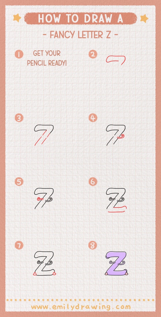
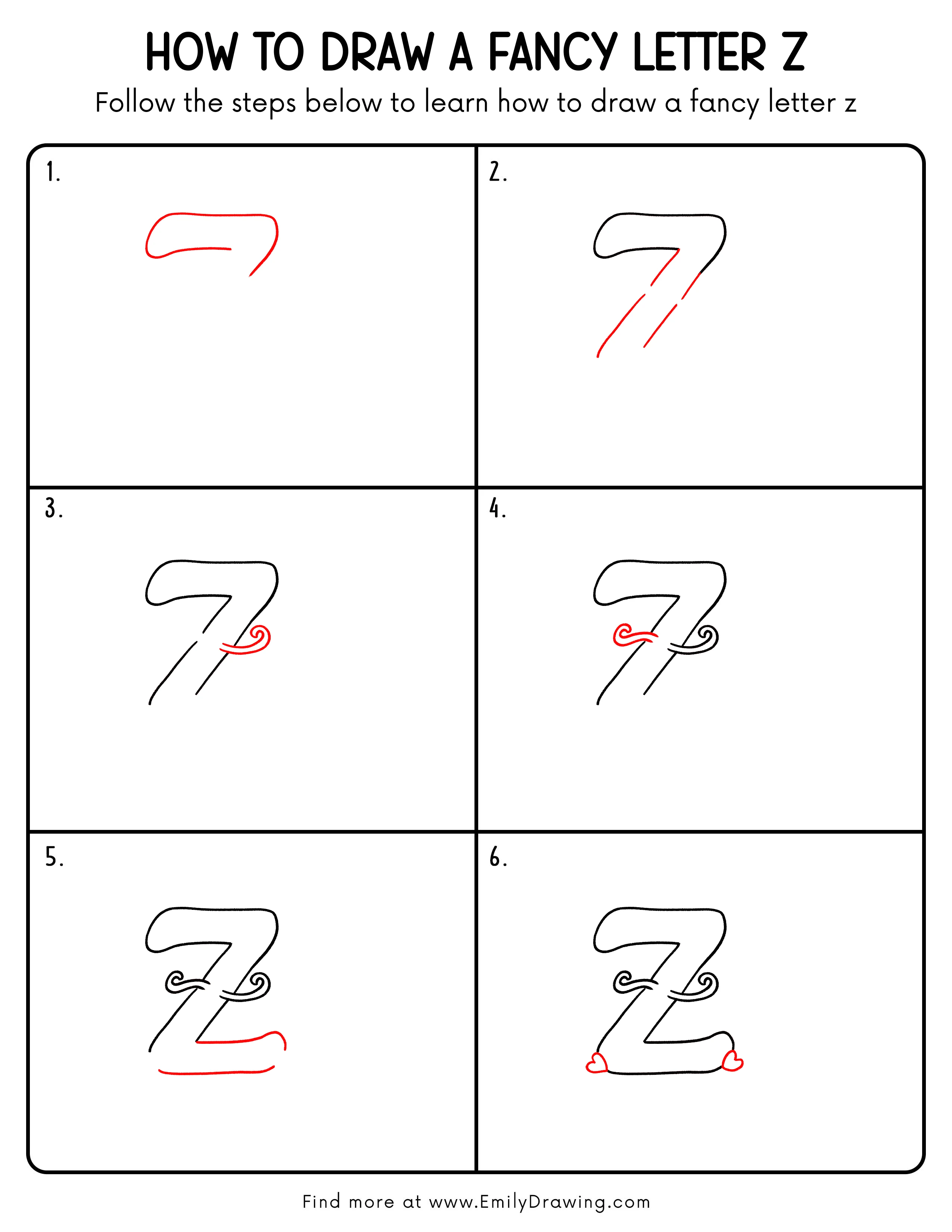
Step 1: Draw the Flowing Top Stroke
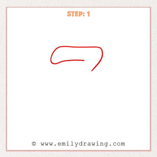
Start with a wide, curved top bar with a soft, rounded left end.
On the right side, pull the line down into a smooth, curved tail to set a fancy “Z” direction.
Pro Tip: Keep the top stroke longer and smoother, and let the right tail taper downward for elegance.
Step 2: Add the Diagonal Main Strokes
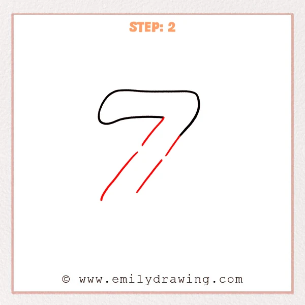
From the inner end of the top stroke, draw a long diagonal line down toward the left.
Add a second, parallel diagonal line beside it to give the fancy Z more thickness.
Pro Tip: Keep the gap between the diagonals even, and let them taper slightly as they go down.
Step 3: Add the Right Curled Flourish
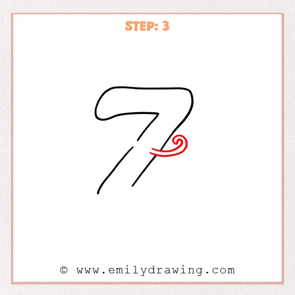
From the mid-right edge, draw a short curve that sweeps outward and curls into a small spiral.
Add a second parallel line underneath it to match the double-stroke thickness.
Pro Tip: Start the spiral wider, then tighten it, and leave a tiny gap at the tip for a clean finish.
Step 4: Add the Matching Left Flourish
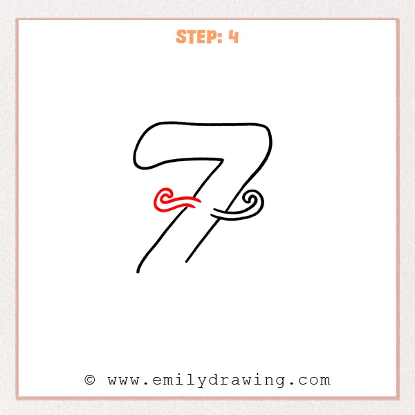
On the mid-left area of the letter, draw a curve that sweeps left and curls into a small spiral to balance the right side.
Add a second parallel line beneath it so the left flourish matches the double-stroke thickness.
Pro Tip: Keep both flourishes similar in size, and let the parallel lines stay close without crossing.
Step 5: Add the Long Bottom Underline
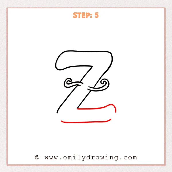
From near the lower end of the letter, draw a long underline sweeping to the right, then curl it slightly upward and round the tip.
Add a second parallel line beneath it to create a double-stroke underline and finish the fancy look.
Pro Tip: Keep the underline long and steady, and make the right lift subtle for a polished finish.
Step 6: Add Little Hearts at Both Ends
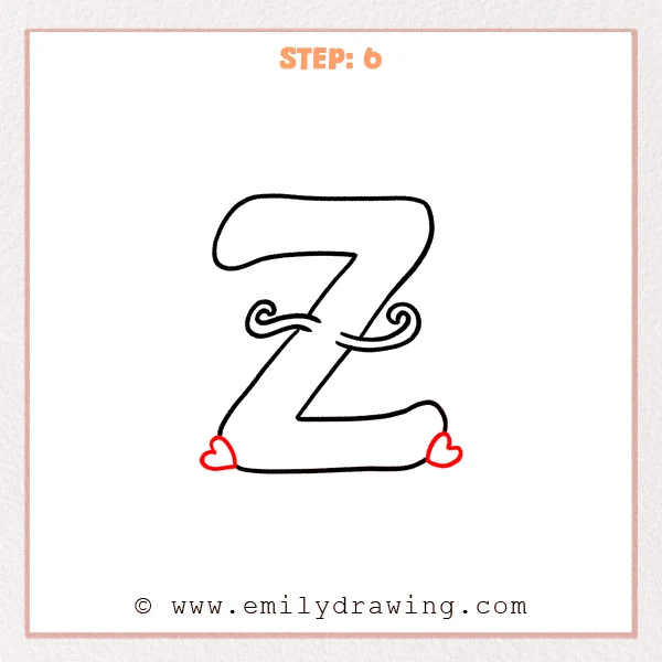
Draw a small heart at the left end of the underline, tucked against the edge like a cute accent.
Add another heart near the curled right end, keeping it a similar size and sitting on the same baseline.
Pro Tip: Build each heart with two small top curves, then close it with one sharp point for symmetry.
Step 7: Color in your drawing!
Fun Facts
- The letter Z can look very different in calligraphy, graffiti, and script styles.
- Adding flourishes works best when you repeat shapes to keep balance.
- Thick-and-thin strokes are a classic trick for making letters feel “fancy.”
Pin it now, Draw later!
Erase any sketchy overlaps and smooth the curves where lines meet.
If you want extra style, trace the outline with a pen and keep the stroke width consistent.
You now know how to draw a fancy letter Z step by step—try making a whole fancy alphabet next!
Get the FREE Printable Drawing Guide
FREE Download Printable Fancy Letter Z Drawing Tutorial
Frequently Asked Questions
How do I make the fancy letter Z look more balanced?
Keep the left and right flourishes similar in size, and align them across the middle.
What if my strokes look shaky?
Slow down, use your shoulder for long lines, and lightly sketch first before tracing.
Can I color the fancy letter Z?
Yes—use one solid fill color, or add simple patterns while keeping the outline clean.