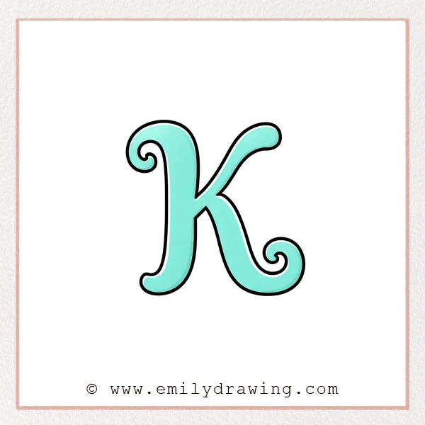
A fancy letter K looks elegant because it mixes strong stems with smooth curls.
This easy drawing tutorial breaks the letter into simple strokes you can control.
Take your time, and let each curve stay soft and steady.
What You Will Need
- Pencil and eraser (or a pen if you feel confident)
- Smooth paper
- A fine liner or marker (optional, for clean outlines)
Here are my RECOMMENDED Art Supplies!
- Crayola Coloring Set (140 Pieces – Mega Value!)
- 24 Colored Crayon Set
- A4 Printer Paper
- Crayola Coloring Pencils
- HP Home Printer with Instant Ink!
Time needed:
19 minutes.
Step-by-Step Drawing Guide
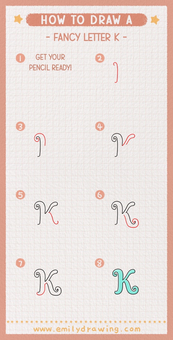
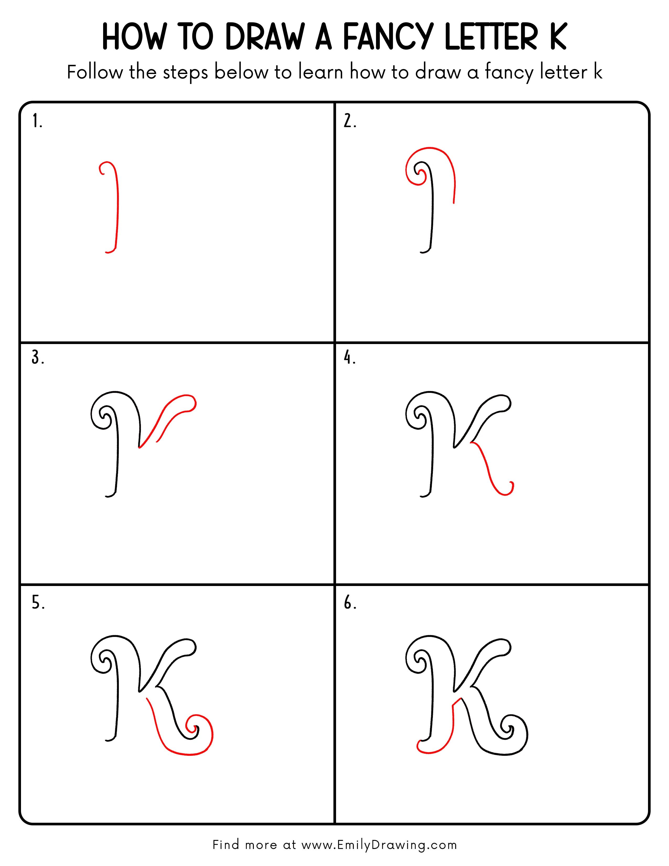
Step 1: Draw the Main Stem
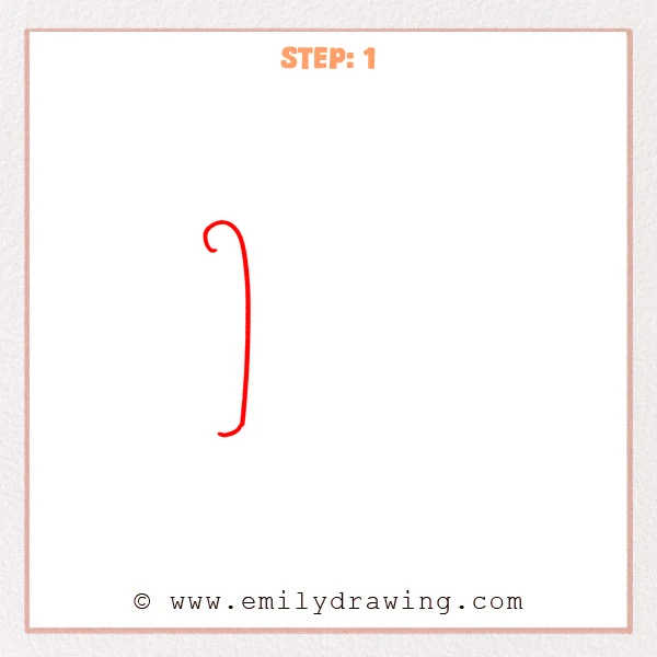
Start at the top with a small left-curving hook, like a gentle curl.
Then pull a long vertical stroke downward, slightly bending right, and finish with a soft leftward tail.
Pro Tip: Keep this stem long and smooth first, so the fancy details feel elegant later.
Step 2: Add the Big Top Flourish
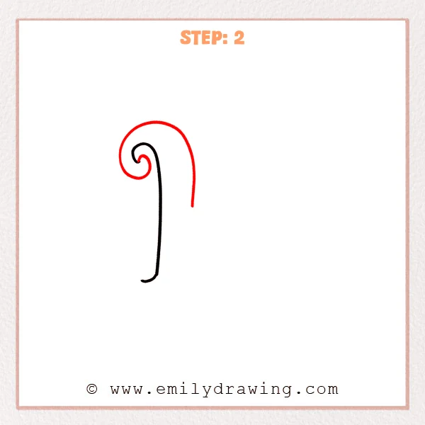
Add a larger spiral curl at the top-left, wrapping around the small hook.
From the outer spiral, sweep a long arc up and right, then drop it down to form the graceful outer outline.
Pro Tip: Keep even spacing between the spiral loops to make the flourish look clean.
Step 3: Add the Right Arm and Loop
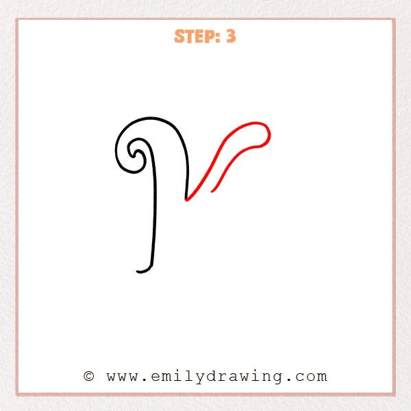
From the upper-middle of the stem, sweep a long rising curve to the right, like a ribbon.
Make a rounded loop at the far end, then add a shorter inner return stroke that tucks back down-left.
Pro Tip: Keep the end loop nicely rounded so the flourish stays soft and elegant.
Step 4: Add the Lower Leg Tail
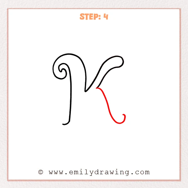
From the inner connection under the right arm, draw a smooth long curve down, sweeping right, then drifting back left.
Finish with a small upward curl so the lower leg ends like a ribbon.
Pro Tip: You can make the tail longer, but keep the curve smooth the whole way.
Step 5: Refine the Bottom Curl and Join
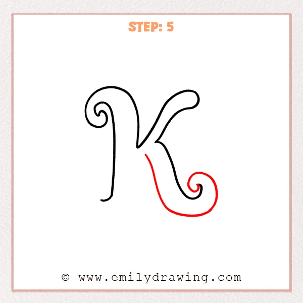
Extend the lower tail into a fuller shape, turning the small hook into a larger spiral curl on the lower right.
Add the inner return line to connect the lower flourish smoothly back toward the center, giving the bottom more presence.
Pro Tip: Make the outer spiral looser and rounder than the inner loop for an elegant finish.
Step 6: Thicken the Lower Part of the Main Stem
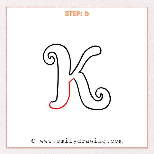
Along the outer edge of the stem’s bottom, draw a parallel line to turn the thin stroke into a thicker downstroke.
Round it into a smooth “shoe” curve at the very bottom, then bring it back up to the center join.
Pro Tip: Keep the gap between the lines even, and the bottom curve will look smooth.
Step 7: Color in your drawing!
Fun Facts
- In calligraphy, thick-and-thin contrast often comes from changing pen angle, not pressure.
- Fancy letters are called “flourished” forms because the curls add decorative motion.
- Many ornamental alphabets use spirals because they feel balanced and calm.
Pin it now, Draw later!
Erase any sketch marks and smooth uneven edges with small, slow strokes.
If you want extra style, gently thicken a few main curves for more contrast.
Now you know how to draw a fancy letter K step by step—try it again smaller or larger to build control.
Get the FREE Printable Drawing Guide
FREE Download Printable Fancy Letter K Drawing Tutorial
Frequently Asked Questions
How do I keep the spirals from looking messy?
Draw the inner curl first, then keep a steady, even gap as you widen the loop.
What if my letter K looks too narrow?
Widen the right arm and give the bottom flourish more space to sweep outward.
Can I make this an easy drawing tutorial with a marker?
Yes, but sketch lightly in pencil first so you can correct the curves before inking.