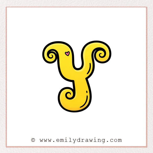
A fancy letter “y” looks elegant because it flows like a ribbon.
In this easy drawing tutorial, you will build curls first, then add thickness.
Take your time, and let each curve stay smooth and relaxed.
What You Will Need
- Pencil (or a light sketch brush)
- Eraser
- Black pen or marker (for the final outline)
- Optional: a red pen to plan inner stroke thickness
- Plain paper
Here are my RECOMMENDED Art Supplies!
- Crayola Coloring Set (140 Pieces – Mega Value!)
- 24 Colored Crayon Set
- A4 Printer Paper
- Crayola Coloring Pencils
- HP Home Printer with Instant Ink!
Time needed:
25 minutes.
Step-by-Step Drawing Guide
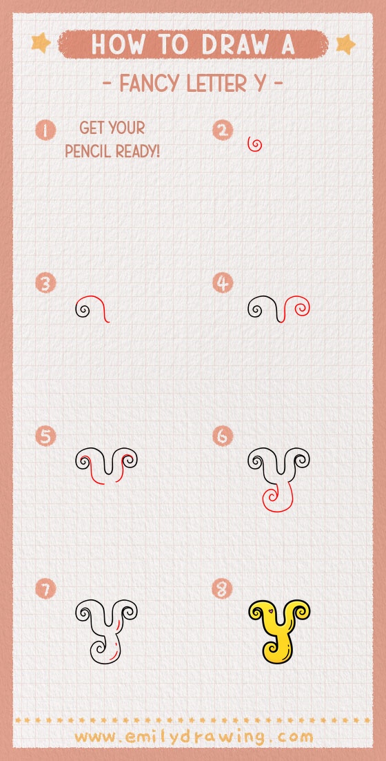
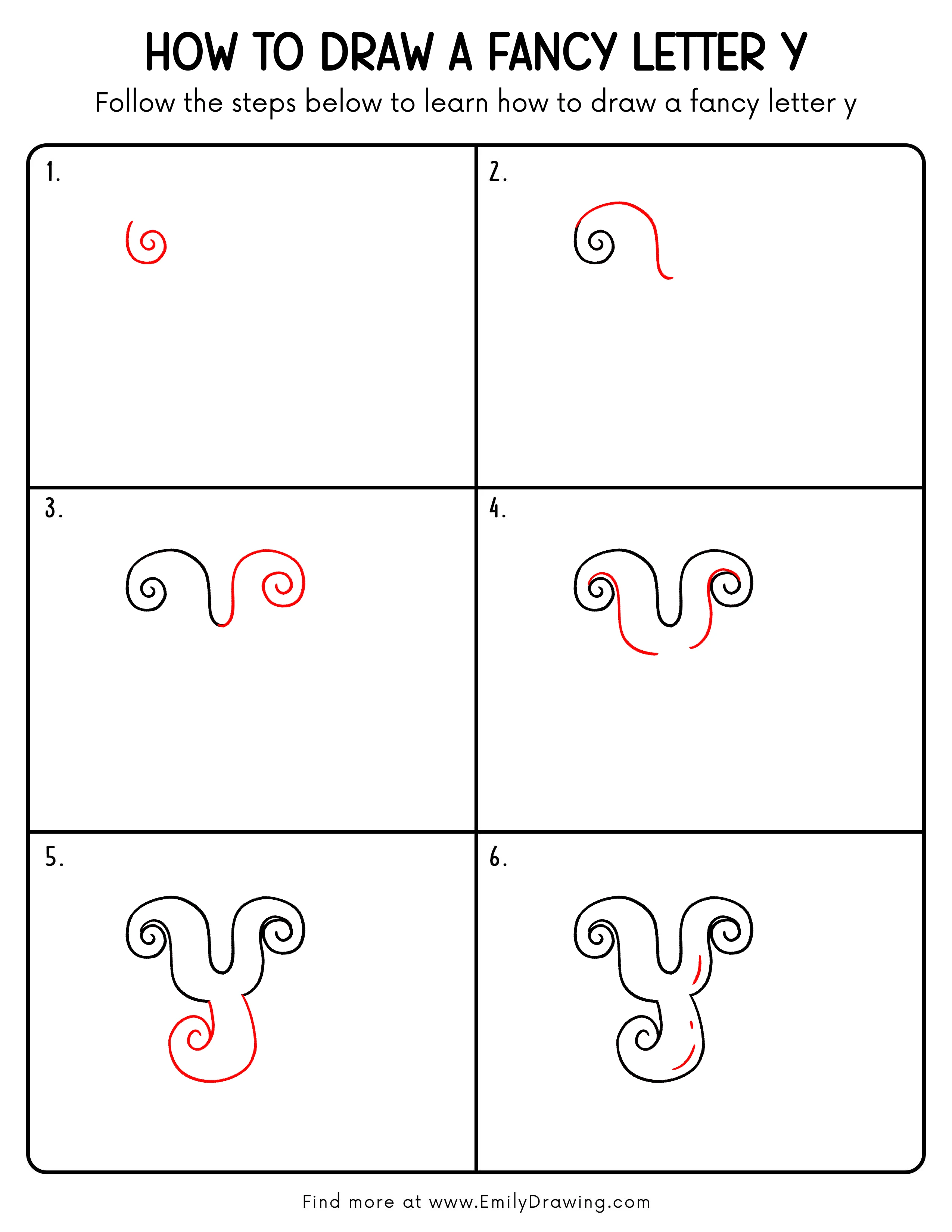
Step 1: Draw the Swirly Base Stroke
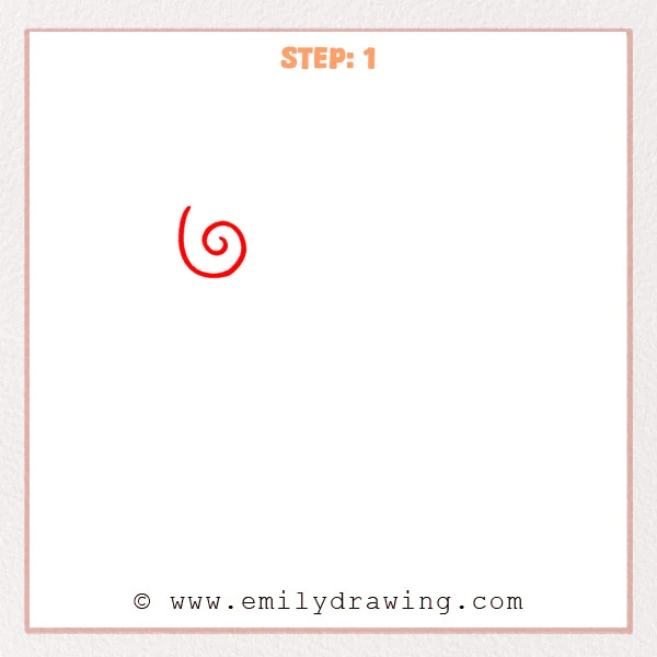
Start with a small loop, then spiral outward into a larger curl.
Leave a smooth, long curved stroke on the left to suggest the fancy “y” flow.
Keep the line light so you can refine it later.
Pro Tip: Let the spiral spacing go from tight to loose for a graceful rhythm.
Step 2: Extend the Arch and Descending Tail
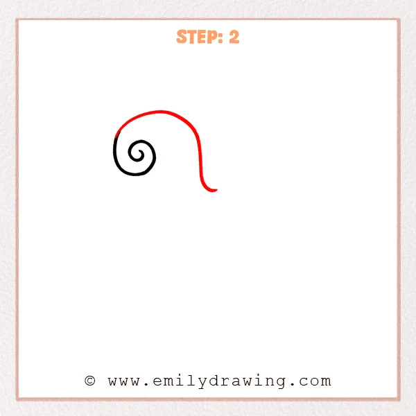
Continue the stroke around the spiral to form a wide arch that sits over it.
Then pull a long downward curve on the right, finishing with a small upward flick.
Aim for one continuous motion so the line feels confident.
Pro Tip: Keep the descending tail smooth first, then taper into a light upward flick.
Step 3: Add the Right-Side Curl
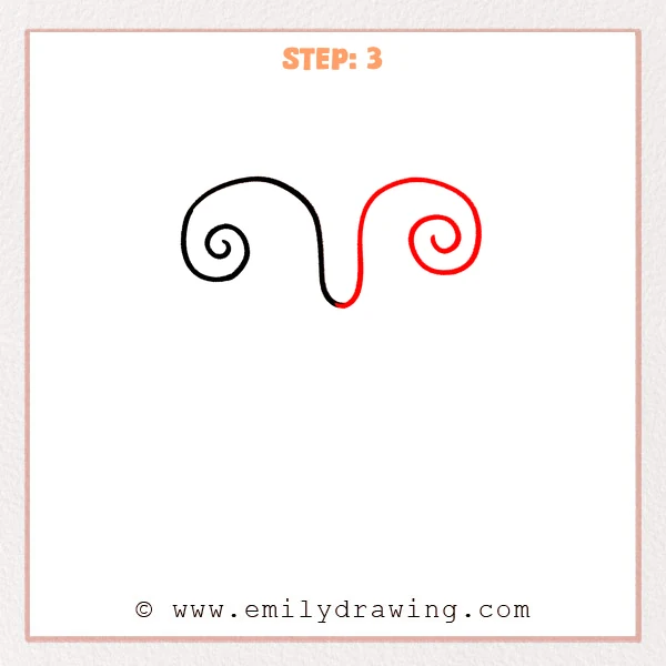
Extend the tail slightly to the right, then curl it into a new small spiral.
Round the middle “U” dip so the two curls feel evenly balanced.
Make both spirals look like they belong to the same style.
Pro Tip: Match the right spiral size to the left, but finish with a lighter taper.
Step 4: Add the Inner Parallel Stroke
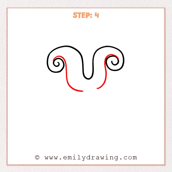
Draw an inner line inside the left curl, following the outline at an even distance.
Repeat on the right side, guiding the inner line into the right spiral.
This creates the first sense of calligraphy thickness.
Pro Tip: Keep the inner line evenly spaced from the outline, especially around curves.
Step 5: Add the Large Lower Loop
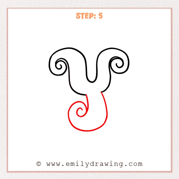
Extend a long curve downward from the center dip, then sweep left into a big rounded loop.
Finish with a small spiral inside the loop, blending the join smoothly.
Let the lower loop feel roomy so the letter has a strong descender.
Pro Tip: Make the lower loop noticeably larger than the top curls for a true fancy “y” descender.
Step 6: Thicken the Descender Stroke
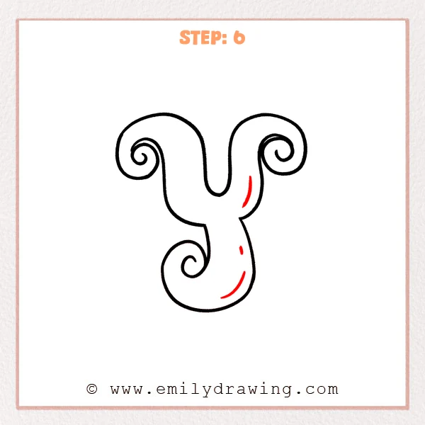
Add a short inner parallel line along the right vertical curve to build thickness.
Then add a matching inner curve along the bottom loop so the width stays consistent.
Keep the ends tapered so the stroke looks elegant, not heavy.
Pro Tip: Draw the inner stroke in small sections first, then connect them into one smooth curve.
Step 7: Color in your drawing!
Fun Facts
- In calligraphy, thick-and-thin strokes often come from a flat nib angle.
- Spirals are common in flourishes because they guide the eye in a smooth path.
- Many decorative scripts exaggerate the descender to make letters feel fancy.
Pin it now, Draw later!
Trace your final outline cleanly, and erase any sketch marks underneath.
If you want extra style, slightly taper the ends or add a tiny serif-like flick.
You just learned how to draw a fancy letter “y” with step by step drawing basics—try another letter next!
Get the FREE Printable Drawing Guide
FREE Download Printable Fancy Letter Y Drawing Tutorial
Frequently Asked Questions
How do I keep both spirals looking even?
Lightly sketch a similar circle size for each curl before you commit to the line.
What if my curves look shaky?
Slow down, draw from your shoulder, and redraw the curve in one calm motion.
Can I color or shade this fancy letter y?
Yes, but start with flat color fills first, then add gentle shading after the outline looks clean.