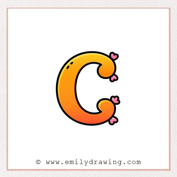
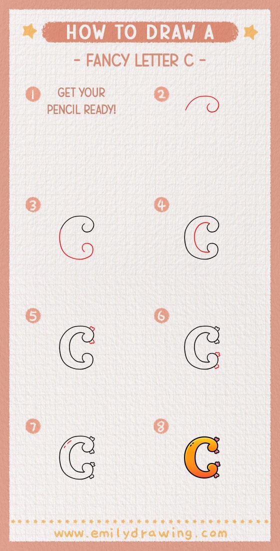
A fancy letter C is a fun way to practice smooth curves and simple flourishes.
This easy drawing tutorial keeps each step clear and beginner-friendly.
Take your time, and let the curves stay soft and rounded.
What You Will Need
- Pencil
- Eraser
- Black pen or marker
- Optional: Red pen for accents and decorations
- Paper
Here are my RECOMMENDED Art Supplies!
- Crayola Coloring Set (140 Pieces – Mega Value!)
- 24 Colored Crayon Set
- A4 Printer Paper
- Crayola Coloring Pencils
- HP Home Printer with Instant Ink!
Time needed:
26 minutes.
Step-by-Step Drawing Guide
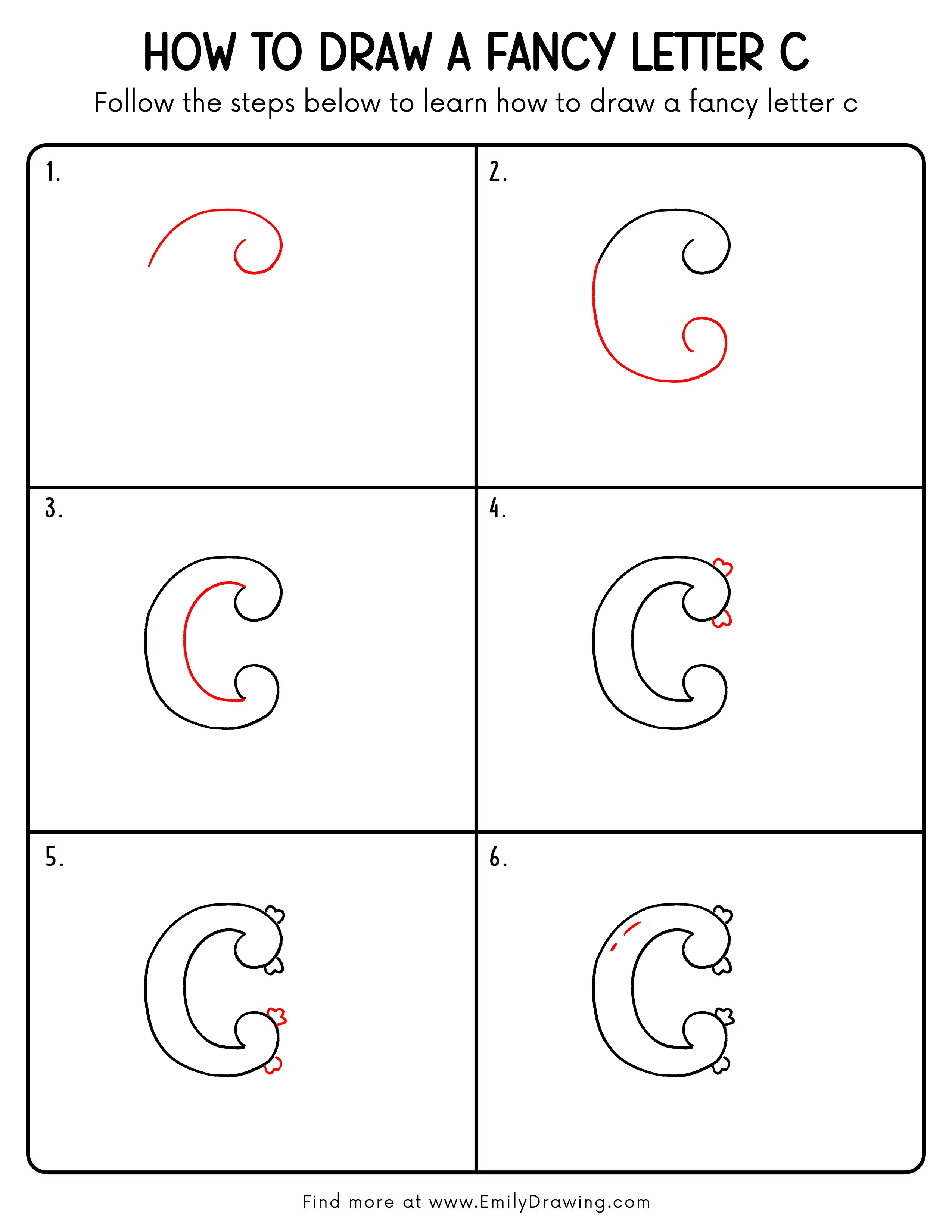
Step 1: Draw the Main Curve
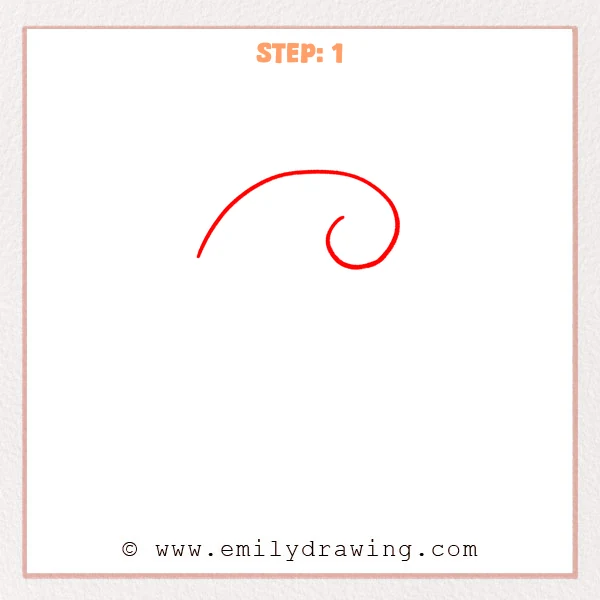
Start on the left and draw one long, smooth arc that rises upward.
On the right, keep the line flowing inward into a rounded spiral to begin the flourish of the fancy letter C.
Pro Tip: Sketch the curve lightly first, then thicken it to your desired stroke weight.
Step 2: Complete the Outer Shape
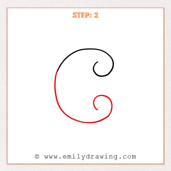
Extend the long arc across the top, then sweep it down and around to form the full outer C shape.
Add a small curl in the upper-right and a tighter inward curl at the lower-right to create a fancy flourish.
Pro Tip: Keep the widest curve on the left-middle so the C opening feels balanced and graceful.
Step 3: Add the Inner Stroke for Thickness
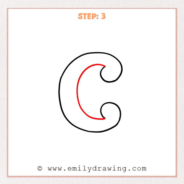
Inside the letter, draw a second curved line that runs parallel to the outer edge.
Leave small gaps near the top and bottom curls so the inner stroke doesn’t crowd the flourishes.
Pro Tip: Keep the spacing between the two lines even for a smooth calligraphy look.
Step 4: Add Heart Decorations
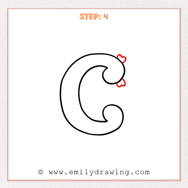
Draw two small hearts near the outer edge of the upper-right curl.
Tilt the hearts slightly and leave a tiny gap from the stroke for a neat, airy look.
Pro Tip: Keep the hearts similar in size and align their tops for a tidy finish.
Step 5: Add Hearts by the Lower Curl
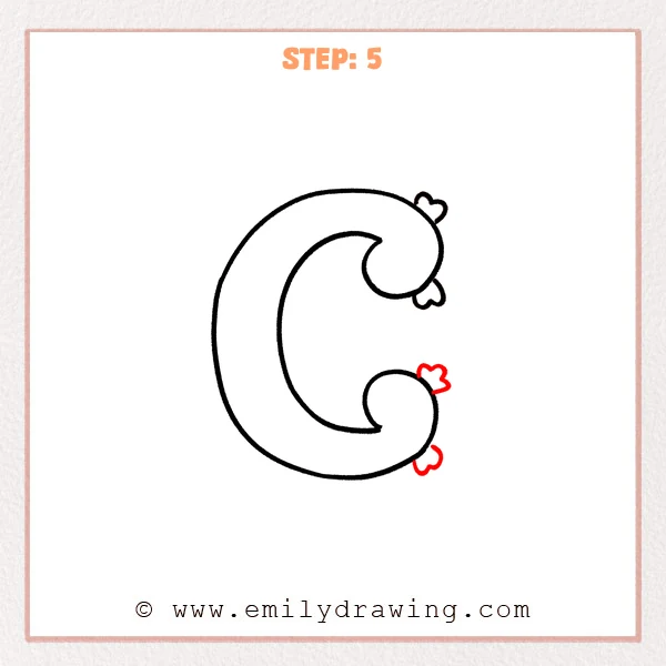
Draw two small hearts beside the outer edge of the lower-right curl.
Leave a tiny gap from the stroke and keep the heart outlines smooth and clear.
Pro Tip: Make the lower hearts slightly smaller than the top ones for better balance.
Step 6: Add Small Highlight Strokes
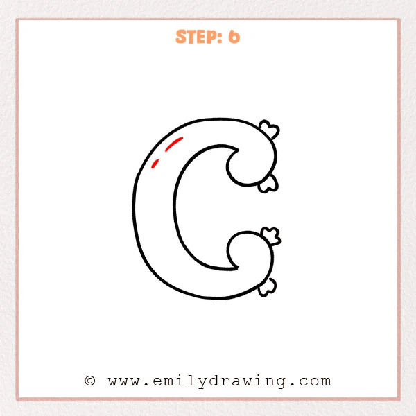
Inside the thick stroke on the upper-left of the letter, draw two short curved dashes that follow the C’s curve.
Make the top dash a bit longer than the one below, like simple shine marks.
Pro Tip: Keep the highlight dashes slightly away from the edge so they feel clean.
Step 7: Color in your drawing!
Fun Facts
- Fancy letters are often called “decorative capitals” in hand lettering.
- Curved strokes usually look smoother when you draw from the shoulder, not the wrist.
- Simple repeats, like hearts and shine marks, can make a letter feel like a logo.
Pin it now, Draw later!
Trace your final lines confidently, then erase any pencil marks that remain.
If you want extra pop, color the hearts or add more tiny highlights.
Now you know how to draw a fancy letter C step by step—try making a whole fancy alphabet next.
Get the FREE Printable Drawing Guide
FREE Download Printable Fancy Letter C Drawing Tutorial
Frequently Asked Questions
How do I make my fancy letter C look more even?
Draw the outer C first, then keep the inner line parallel with steady spacing.
What if my curls look too tight or messy?
Open the curl shapes slightly and redraw them with one smooth motion.
Can I decorate the letter with something besides hearts?
Yes, try stars, dots, leaves, or small swirls that follow the same curve.